Pages

Wednesday, September 30, 2009

I Love You.

Something a little different: a long card.
It's a long card that I cased from Tracy. Her card is absolutely adorable! It measures 8.5" by 4". I used kraft from PTI, and the patterned CS is from M (Just Chillin').
The heart is cut from George at 2". I cut two from the kraft (instead of using chipboard) and glued them together. I used my button hole punch on the kraft so that I could easily tie the hemp through both the heart and the button. A little sewing, ribbon, and the sentiment is Inkadinkado.

Tuesday, September 29, 2009

AiFactory Challenge 5

Todays challenge over at AiFactory is to make a project with a minimum of 3 layers (the base counts as one layer). So here is my project:
These two cuties are Alicia and Ivan (and are for sale here). I printed them 3 times. I have way more than 3 layers on this card, but for Alicia and Ivan alone, there is the base digi that includes the entire image, the second layer includes the skates and jackets (and heads), and the third layer is their heads.
I used pop dots in between the layers for the 3D effect that catches shadows just beautifully. I really like the way this card turned out. The sentiment is from a Michael's acrylic stamp set, also on pop dots. So for your chance to win Alicia and Ivan, head on over to the AiFactory Challenge blog and enter your "at least 3 layers" project!! It's just that easy.

Monday, September 28, 2009

Two More Punch Cards

So a long time ago, I missed one of my favorite classes. My SU lady had a few punch classes over the summer, but I wasn't able to make it to one of them but ordered the kit. My kit was collecting dust! I finally found a little time to myself and was able to complete these two cards:
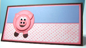
So I think this is just too cute! It's supposed to have the pig's butt on the other side, but my kit was missing the round punch. I know Ruth would happily get me one, but I didn't want to let her know it's taken months for me to get to these.
Lots of circles, the word window punch, 3D dots, and inks. There isn't a sentiment since I wasn't at the class to pick one out, but I thought I'd leave it blank till I'm ready to use it. Also, this is about the size of a dollar bill - so it would be great as a money holder.

Here is the other one I was able to complete.

Now is it just me or do his spots look like the Earth? They also somewhat look like arms/hands. What do you think? Obviously, I'm not overly fond of this one. These are still great fun to put together though.

Friday, September 25, 2009

Colorado Wedding

So my Mom called last night and asked for a wedding card...last minute. Of course I said I'd make her one, so off to my room I go.

Over at Splitcoaststampers, last weeks CAS challenge was to make a wedding card. I didn't have a need for a wedding card so I thought I'd skip that one and wait for the next. Well, who knew?!

Anyway, this card uses PTI cardstocks, Stampin' Up stamps, chalk inks, and Nesties in the Cuttlebug.

Wednesday, September 23, 2009

Make a Wish

So last week, Dustin Pike was offering this amazing deal on his digi-stamps. I just HAD to take him up on his offer. Since I got them, I've been coloring like crazy...now I just have to put cards together...because without cards, then you're just a kid coloring (NOT that that's a bad thing)

So I colored this fairy with my Bic Marks It pens and used my new Nestabilities in my Cuttlebug to cut and emboss around the image. There are so many new Nesties out there, but patience is a virtue (at least that's what I'm told)

The papers are from my unknown stack. The sentiment is a $1 acrylic set from Michaels (G stamps), I added rhinestones, and of course pop dots.

Tuesday, September 22, 2009

Challenge and Tutorial

There is a challenge over at Aifactory and the winner will receive a really cool set of digi-stamps. I used the digi-stamp set found here, and the challenge involves a color scheme that I attempted to use in my card here:
The card uses the oval frame from the Jasmine Cricut cart cut at 3" and the spider from Doodlecharms cut at 2.25 ". From this digi set, I also made a tag (using George), and a possible embellishment for a card, gift bag, or scrapbook (using Accent Essentials).

Tutorial - How to use digi-stamps with Cricut die-cuts:
First, cut out shapes using Cricut in size desired for card or embellishment. I know the Expressions has a "center" cut option, but it is not always exact when dealing with smaller or odd shaped digistamps or regular stamps.

I print images out to the size desired on a regular piece of printer paper (great way to use paper in your recycle bin) - I make sure they will fit on the diecut shapes.
Using double sided tape, cover images with diecuts and run through printer a second time. Make sure to load the sheet in the same direction.
Here, the images have printed exactly where I want them on my diecuts. From here, finish assembling your embellishments or project. For these stamped diecuts, I have used the Jasmine oval frame cut at 3", the triangle with rounded corner using George cut at 2.75", and the purple cut is from Accent Essentials cut at 2.75".

Friday, September 18, 2009

My Big Brother Turns 40

My brother lives in Colorado, so I don't get to see him much and I wanted to be sure to make him something special.
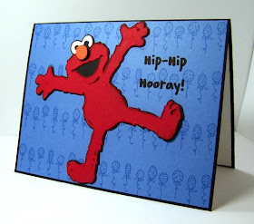
Why Elmo? Why not? He's much like a kid, and from what I understand, age is just a mind-set. Elmo is from the Sesame Street Friends Cricut cart cut at 3.5", I distressed his "fur" a little and popped up his nose. I printed the balloons in blue on blue cardstock. The balloon doodlebat is DB Borders from Scrapnfonts, and the sentiment font is CK Kiddo.
Here's the inside. I used Plantin Schoolbook for the 40 and the computer generated font is CK NiteLite. I included $2 and 5 dimes taped inside. Do you remember getting change taped to the inside of a card when you were young? That was so cool! I don't think kids get gifts like that anymore. They get actual presents wrapped up. Whatever.

Thursday, September 17, 2009

Party Dress

For last weeks CAS challenge over at Splitcoaststampers, the objective was to pop something up. Considering my love of pop-dots, this was a no-brainer.
I started with PapertreyInk bright white cardstock. I used my stamp-a-ma-jig to center the stamp from Stampin' Ups Chic Boutique set. I stamped the sentiment, then moved on to the pink dress.
So I stamped the dress on pink CS. I cut it out with my xacto knife and thought I would embellish it further. Well, I messed the whole thing up so I started over. What should have been a 20 minute card turned into a 40 minute card. Some things are best left alone. I also added glaze to the fringe but it doesn't show up in the pic.

Wednesday, September 16, 2009

Pumpkin Girl

There is a really nice sketch over at Mojo Monday (sketch 104) and I thought it was a great opportunity to make something for Halloween.
Here is a pic of just the card that follows the sketch. I used an adorable digi-stamp from AiFactory. The great star-like shape behind the images (in black cardstock) is cut from the Accent Essentials cart (Cricut).

I also made several sour cream containers using the same digi-stamp for the teachers at Bean's daycare. They are so good to her and I try to remember them at all holidays and special occasions. These are filled with Hershey Kisses.
The little gifts are for the AiFactory challenge. Head on over there to participate in this challenge for the opportunity to win a free digi-stamp. I colored my images using Bic Mark It markers. I used a little glaze on her hair for added shine.
What's great about digi stamps is that you're not confined to one size. The card image is printed at approximately 2.25" while the image on the sour cream container is 1.5".

Tuesday, September 15, 2009

Live, Laugh, Love

For FTL6 over at Clean and Simple Stamping, I just had to use pop-dots.
What's funny is I love the colors, I love the sentiment, I love the layout, but I don't really love the card.
Can you see the dimension in squares 2 and 4? I think I'm going to give this layout another try. Paper from M and sentiment is Inkadinkado.

Monday, September 14, 2009

So Sweet

I really like the way the cardstock from PapertreyInk embosses (no I do not work for Papertrey in any way). There are some thinner cardstocks that I've embossed and just don't like the look. The PTI cardstock doesn't crack and the impression is crisp.

So I ran just the front of this card through the Cuttlebug using the dots folder. Added a strip of pink, rounded the corners, added ribbon (the ends are hidden under the ice-cream cone), and used 3D dots under the image.
The image is a $1 acrylic stamp set from Michael's, colored with prisma pencils and OMS, cut with my Nestabilities. Looking at it now, I think I will add a white insert for writing and a little glaze on the ice-cream. Think this is considered a CAS card?

Friday, September 11, 2009

Not Quite One Layer

I found a quote I really liked and wanted to do a one layer card. I also got a new paperstack and really wanted to use the mushrooms. So this is my compromise:

Now this is definitely a 10 minute card.

Thursday, September 10, 2009

Hello Kitty

I've been meaning to use the Hello Kitty cart for the kitties and not just the extras, so here's what I came up with.
The layout is card sketch SC10 over at Splitcoaststampers. The kitty is cut at 3" which is actually quite small considering all the layers. I inked/shaded her and her clothes and used rhinestones on her bow.
After putting her all together, I didn't really want a sentiment on the front...and I think it works.

Wednesday, September 9, 2009

Christmas Quest

In my quest to make my Christmas cards this year...

Using PapertreyInk cardstock for the base, this card is a beautiful red. The stamp is from Recollections (I should double check the name of these stamps) from Michaels, stamped in green chalk inks, and black stazon.

Last but not least, 3D dots! Love 'em.

Tuesday, September 8, 2009

Little Monster

Ever wonder if the "Purple People Eater" was in fact purple in color or if he only ate purple people? Well, if you have no clue what I'm talking about, then let's just say I'm much older than you.
For the latest card sketch over at Splitcoaststampers (SC244), I tried to go clean and simple. I used cardstock from PapertreyInk and the web patterned paper is from my unknown stack.
The image is from Recollections. At least I think that's the new line of stamps being offered at Michael's. He is colored using prisma pencils and OMS. I added just a little shine to his eye, horns, and toe nails.

Saturday, September 5, 2009

Woof!

This is based on FTL5 (Fall-to-layout 5) over at Clean and Simple Stamping.
The blue cardstock is PapertreyInk, stamps are Inkadinkado, brown chalk ink, brads, and 3D dots as usual.
I stamped and fussy cut around the bone and adhered with a 3D dot. I love the decoration on his back.

Friday, September 4, 2009

Black Widow

Sunday night I was bitten by a black widow spider. I was in the emergency room for close to 12 hours on some pretty strong drugs. Most of the week was a blur. What I do remember is pain...lots of pain.

This card is made for the family of the black widow I killed. OK, not really, but I did make it with thoughts of my experience in mind.

CAS card using rik-rak, PapertreyInk cardstock, $1 stamps, Stazon ink. I don't really know what to do with this card...but I got it (and the venom) out of my system.