Thursday, August 27, 2009

Help Me Diet

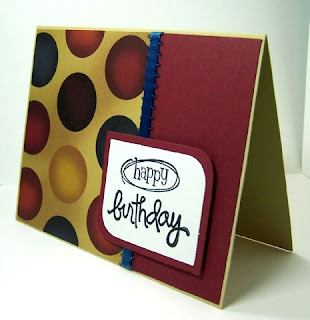
I made this for my little cousin Sarah (do NOT read this if you haven't received the card yet!!) and for card sketch SC242 over at Splitcoaststampers.
I believe this uses the Armadillo CS pack. Got it from Joanns a while back and it has some really "groovy" prints. The stamp is Inkadinkado colored with prisma pencils and mineral spirits. The towels are glazed with the image popped up.

The inside reads: All I've lost is 31 days. Isn't that just the truth?

Wednesday, August 26, 2009

Eat Cake!

I really like the way this one turned out. It's based on Clean and Simple FTL4 (Fall-to-layout 4).
The cake is a doodlebat from Scrapnfonts, printed twice, colored once, and pop-dotted for dimension. I used prisma pencils and mineral spirits to color the image and used a little glaze on the frosting and cherry.

Tuesday, August 25, 2009

October

There were three challanges for the CAS DT call over at Splitcoaststampers. One is to make a monochromatic card (thus the brown baby buggy card below). The other is to create a card for Autumn.
I used Papertrey Ink CS (the names are a lot more fancy than yellow and red). The stamps are Stampin' Ups Fancy Trees using Ranger inks (Ranger inks work really well with rubber stamps - not so well with acrylic).
"October" is a $1 stamp from Michaels using chalk inks.

I don't really use or sent out cards for Fall, but my Auntie Diane's birthday is in October - so this is made with her in mind.

Vintage Baby Buggy

Well that's what this card reminds me of.

This is a CAS card for Splitcoaststampers CAS Design Team call. Don't know if I have a chance - you should see all the talent over there, but thought I'd give it a try.

I started our with brown CS from PapertreyInk. I love their 110lb CS. Added a little ribbon, inked up some white CS with Ranger inks and splashed with a little water to create background, stamped buggy using Stampin' Ups Puns from the Past stamps, cut and embossed with my new Nestabilities in my Cuttlebug.

OK, now one part of the challenge is to add a little bit of red. Just a little. So, I used red embossing powder and put a little on the buggy handle and wheels. Can you see it? Wish me luck!

Friday, August 21, 2009

Celebrate the Earth

This super simple, CAS card uses a paint chip from Home Depot. I've actually made a few of these in different colors, but haven't shared them here yet.
Now I'm not saying go to Home Depot and take all their paint chip samples. But if you happen to have one laying around, here is an idea of how to save it from the landfill.

I stared out with 110lb heavyweight, bright white paper from PapertreyInk. Cut the paint chip down to appropriate size, punch out a couple designs, use 3D popdots to adhere, and stamp sentiment.

Thursday, August 20, 2009

Another Quick Card

I just love these papers. This picture just doesn't show the true colors.

Again, I used a doodlebat from Scrapnfonts, used a scallop circle behind it with 3D dots in-between for dimension.

I made two, just placing the ribbon in different areas. The designer CS is "M" (Just Chillin). Stamp is Inkadinkado. The ribbon is $1 ribbon from Michael's and the orange paper is from the unknown stack.

Wednesday, August 19, 2009

Celebrate Plaid

Just a quick post.
I made this using a doodlebat from Scrapnfonts. I made the flowers in blue and knew I wanted to mat them in the same color, so I made a blue word box and filled it with the same color of blue.
I used paper from a new paper stack I love (I believe it's from M). I cut the squares with the doodlebat flowers at 1" and the blue boxes slightly larger. Used 3D dots for the dimension, added twine, and stamped a sentiment.

Tuesday, August 18, 2009

One Layout, Two Cards

Back to Clean and Simple....well, I'm attempting to do each layout. So, this is for FTL3 (Fall-to-Layout 3). I really like this one. Not just for the speed of putting together a card, but for the diversity.
My first card is made using the elephant from the ZooBalloo cricut cart. I cut this at 2 1/2" and again using the outline feature.

I used my cropadile for the eyes, using black cardstock and glaze.

The only inking/shading is on the outline. I used pop dots under the little guy, added ribbon, and the sentiment is from Inkadinkado.

My second card uses a stamp from Stampin' Ups Chic Boutique.
Same layout, but I think they look very different. I think the baby card looks much more whimsical than the thank you card.

Monday, August 17, 2009

Hugs to You

I've been spending a lot of time at Clean and Simple Stamping because I just love the layouts. What I like about them is that you can make them really easy, or you can embellish all you want. One layer, two layers, doesn't matter. But the layouts are really great.
Using FTL2 (Fall-to-Layout 2), I created this card using cricut carts Plantin SchoolBook for the zigzag (cut at 1 3/4") and Beyond Birthdays for the sentiment(cut at 2").
My first attempt at this was using only kraft (from PapertreyInk). I wanted to make the entire card one color. I've seen them done before and thought they were just beautiful. Well, I couldn't stand it, so I added the red shadow on the sentiment and the red button.
I did hold off on 3D dots though. I usually put those everywhere! Added a little twine, and I stopped. Just sat back and left it alone - otherwise I know I would have added more and probably messed it up.

Friday, August 14, 2009

A Little Bit of Bling

The CAS challenge over at Splitcoaststampers this week is to use bling. Well I can do that! So this is my creation for CAS27.
I attempted to do a 10 minute card since I had a few minutes before having to leave for an appointment, but this actually ended up taking around 20 minutes instead.
I used stamps from Stampin'Ups Garden Whimsy set. Stamped the butterfly and fussy cut around it. Then stamped the sentiment. I used my Nestabilities to cut and emboss the squares.
What took me so long was deciding just where I wanted to put the rhinestones. A little tacky glue goes a long way. And of course, lots of pop dots. I popped up the butterfly as well as the square.

Thursday, August 13, 2009

Frosty the Snowman

Well, this year I'm getting a jump start on Christmas Cards. Last year I didn't get around to making any...hmmm, I didn't the year before either. This year I'm determined!
So this absolutely adorable digi stamp came from DustinPike. I colored him with prisma pencils and gamsol.
I used Splitcoaststampers card sketch SC21 for my layout. I cut the DP 5" by 3.75", cut in fours, and placed evenly on the blue CS cut at 5.25" by 4".
I used my Nestabilities in my Cuttlebug to cut the glitter CS scalloped rectangle, and to cut and emboss the inner CS rectangle. I didn't include a sentiment on the outside, but figure I'll stamp something inside later.

Friday, August 7, 2009

So I'm a Little Late

My little one turned two....in May. I know, I know, it's already August. I barely put together a party at the last minute and didn't even think about a card. I knew I needed to make her one, because my plan is that every year, I write on one side of the card about memories and feelings, and her Daddy writes on the other side - usually not as mushy as what I put on paper tho.
So when I saw the latest card sketch over at Splitcoaststampers SC240, I knew it was time to make her birthday card. And I also knew I wanted to use my Cricut on this one.
I used Stretch Your Imagination and cut the cake at 3" out of glitter CS - used multi cut 2. Wow, that stuff is messy and does a number on your cutting mat! I also cut the cake using the silhouette feature in pink. I tried it in glitter pink CS first, but didn't like the look. I think the regular pink CS, shaded with chalk inks and glazed, looks much better.
I used plenty of pop dots on this one. The circle is cut with George at 3.5", the DP is from my unknown stack, and the border strip is done with a Martha Stewart punch.

Thursday, August 6, 2009

Super Simple

Do you ever buy paper because it's just so pretty...then you don't want to cut it up...so it ends up in a pile unused? Well, maybe it's just me then.

I finally decided to try to break my "mine" pile of pretty papers. They need to be used. They need to be seen. They deserve to be on cards!

So these are super simple 10minute cards. I used lots of 3D dots on the sentiments.
I also wanted to make something more masculine and I think I've done just that. So I have Stampin' up cardstock, patterned paper from the unknown pile, ribbon, stazon ink, $1 stamps, 3D dots, and a corner rounder. I made 2 of each in under 20 minutes.

Wednesday, August 5, 2009

Plaid Tree

I recently got the Woodsy doodlebat from Scrapnfonts and just love it. Believe it or not, I got it just for this tree trunk.

I printed the tree trunk on 80lb white cardstock, punched 1" circle "leaves" out of a new paper stack I'm loving, and used 3D dots to adhere the leaves for dimension.
Before printing the tree trunk, I used a word window to create the sentiment (using Tall Pen at 14pt) and placed it close to the tree. If you don't know about doodlebats, they are just like digi stamps. So you pick the size and color and print. No ink, no stamp clean-up or storage.

Monday, August 3, 2009

Simple Owl

I really like this stamp. I recently posted another take on this stamp, but I just can't get enough of it. I made two versions - since I'm needing to make lots of cards at the moment for different occasions.
So obviously these are the same exact cards, just different colors. I sewed the solid and patterned CS together, stamped the owl twice, once on solid and the other on the pattern. Cut out the solid owl and popped him up with 3D dots.
I used heavyweight kraft for the base. Now here's my little secret: I stamped the owl on the solid colored piece of cardstock, but didn't have enough for both the card AND the owl, so I used my xacto to start the cut and finished with my scissors - without cutting up the entire piece of solid CS. So, basically, the solid colored CS under the patterned cardstock has a hole in it (from where the owl was and was cut out). But with the base being heavyweight, and the other CS being thick, you can't even tell anything is missing! Not even if you hold it up to the light. Well, there's no use in using TWO pieces of CS right when you can get away with using just one.

LinkWithin

Blog Widget by LinkWithin